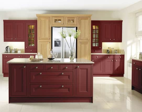
Berry gold December


Clever chaps at leading paint companies Pantone and Dulux predict Marsala, “a naturally robust and earthy wine red” shade, and Copper Blush, “an orangey coppery tone”, will rule in 2015.
While fashionable way-out colours, which star on the catwalk, can struggle to easily translate into the real world, these two easy-on-the-eye concoctions could not only suit most settings, but also pair well together.
Advertisement
Hide AdAdvertisement
Hide AdEven better, plumping for one or both might put an end to the curse of colour craziness.


Apocryphal stories abound, of people being found gibbering in darkened rooms unable to choose between such perplexing labels as Elephant’s or Dragon’s Breath. Others simply resolve a colour crisis - decor disagreements over colour are a common cause of couples’ rows - by falling back yet again on what’s known in the trade as ‘safe-as-houses white’.
In-your-face colour, it’s true, may not be for the faint-hearted, but there’s no better time to play with a warmer palette, a trend which experts say is a reaction to a more positive general global outlook, and replaces those cool blues and greens.
Embracing rich but subtle hues could not only give a much-needed glow to rooms, vital throughout the remaining chilly months, but also conjure a seductive setting whose style will endure far beyond the season.
Advertisement
Hide AdAdvertisement
Hide AdPantone’s Colour Institute, which has nominated a ‘colour of the year’ since 1990, last year opted for Radiant Orchid, a bright blend of fuschia, purple and pink, which claimed to “encourage creativity and innovation”.


This time around, berry-rich Marsala promises, according to its creators, so much more than a different look to your walls.
It’s a shade to “enrich our mind, body and soul, exuding confidence and stability... its grounding red-brown roots emanate a sophisticated, natural earthiness”, notes Leatrice Eiseman, executive director of the Pantone Colour Institute.
Dulux is also proud to lyrically boast of Copper Blush’s powers. It’s “a heart-warming shade with real depth, which creates an easy to live with atmosphere but with a touch of elegance”, according to Rebecca Williamson, senior colour and content manager for Dulux.
So if your taste is for Marsala — it took its name from an Italian fortified wine — or you want to bang the drum for copper (blushing or otherwise), check out these ways to colour up at home in 2015.